eHealthier
Loginless ePROM completion
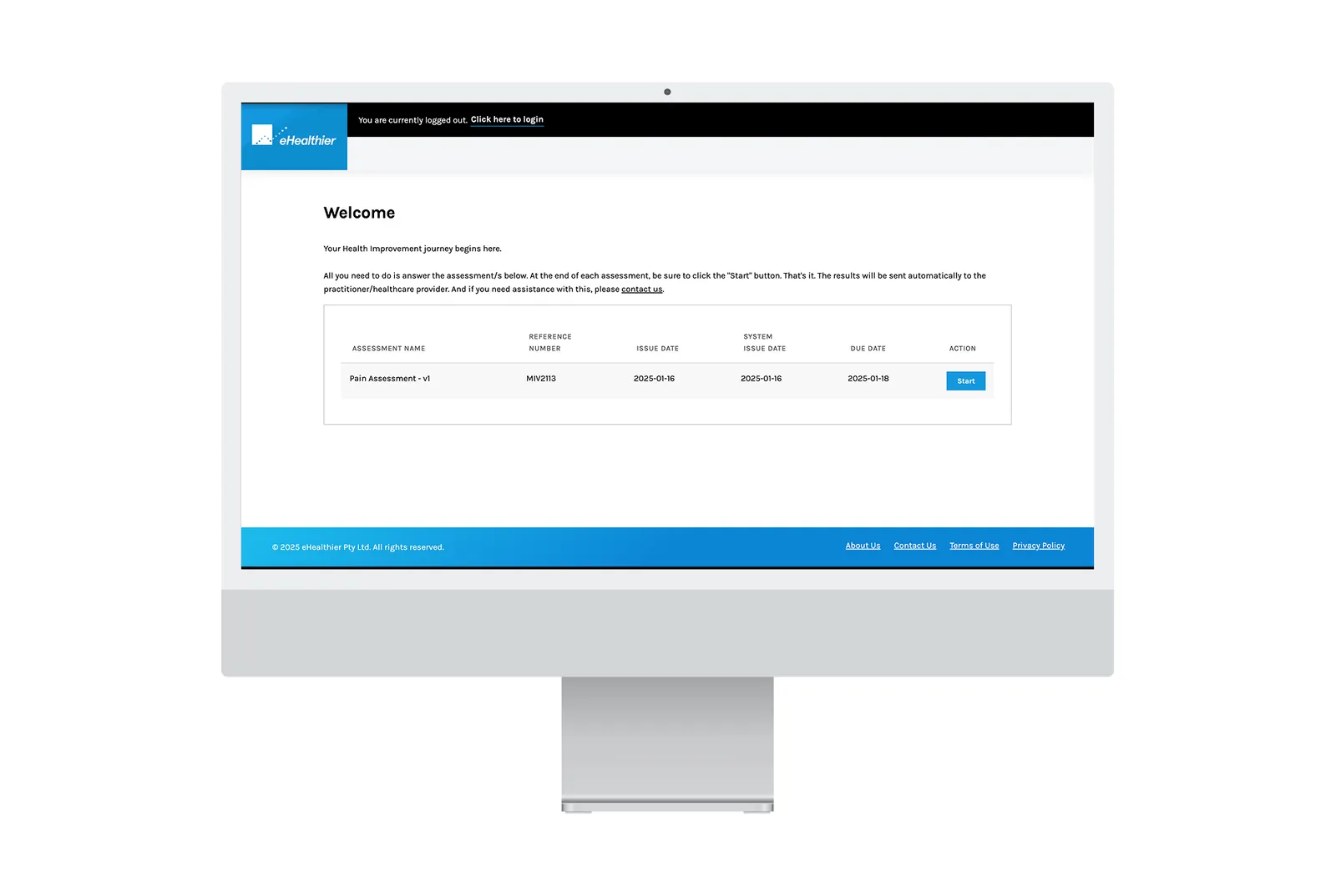
Patients had to log in before they could complete a health survey, and many never did. I initiated and led a loginless flow: one-time links, lightweight consent and saved progress.
- Outcome
- Completion rates up 45% in 3 months; login support tickets down 60%.
- Role
- UX Designer & Researcher: initiated the concept, led design and research
- Team
- Development, UI, security, legal and directors
- Timeline
- 2 months, end to end
- Methods
- Interviews · surveys · analytics review · competitor review · wireframe testing with less tech-confident patients
- Deliverables
- Redesigned patient flow · one-time-link access · lightweight consent step
- Skills
The problem
An ePROM (electronic patient-reported outcome measure) is a short questionnaire a clinician assigns to track a patient’s symptoms, function and quality of life between visits. To complete one, patients first had to register and log in. That was especially hard for elderly and less tech-confident patients, and it undermined the platform’s core purpose: collecting the data.
Before
Login required
- Provider adds the patient’s details.
- Patient gets a registration email or SMS with a temporary password.
- Provider assigns an ePROM.
- Patient clicks “Complete PROM” and lands on a login screen.
- Blocked until they find the original registration message and create an account.
After
Loginless
- Provider adds the patient and assigns ePROMs.
- Patient gets an email or SMS with a secure one-time link.
- The link opens their assigned ePROMs, with consent at the start.
- They complete the survey, saving progress if they need to pause.
- Results are captured, and the patient can set up an account afterwards if they want.
Research
Interviews, surveys, analytics and competitor reviews showed the login wall was the main drop-off. Patients wanted a “tap-and-go” start, clinicians needed reliable completions, and any approach needed clear, lightweight consent for medical data.
-
Pain point
Many patients ignore registration messages
Older and less tech-confident patients didn’t understand temporary passwords, and messages got buried or flagged as spam.
-
Blocker
Registration caused drop-offs
It blocked access to ePROMs. Providers: “We can’t collect data if they never log in.”
-
“Just click and start” was preferred
A one-time link reduced confusion and sped up completion, with strong positive reactions in tests.
-
Consent must be clear but light
Legal and security flagged it early. Consent at the start of the survey worked for patients.
-
Saving progress was critical
Many patients paused mid-survey in testing. Saving reduced frustration and abandonment.
Design
I sketched flows and low-fidelity wireframes for a one-time link and tested them with less tech-confident patients; direct access consistently reduced confusion. Working in Figma and on paper, the design then evolved:
- Email and SMS templates refined for readability and reassurance.
- Save progress added after testing showed patients often paused mid-survey.
- A consent step added at the start, at legal’s request.
Working with engineering
I worked with development, security and legal on the secure one-time links and a lightweight consent step.
Impact
- Completion rates improved by 45% in 3 months.
- Support tickets for login issues dropped by 60%.
- Clinician satisfaction increased, with fewer follow-ups needed.
“I didn’t need to ask my daughter to help me this time. It was so simple.”
“This small change transformed the way our patients interact with the platform.”
Reflection
The original platform assumed digitally confident patients. This project showed the need to design for everyone, especially in healthcare, where accessibility is critical. Simple, familiar flows are often the most effective, and working with legal and security matters as much as design and development.